Hercules Moving Brand Identity & Logo Design
Chicago, Illinois
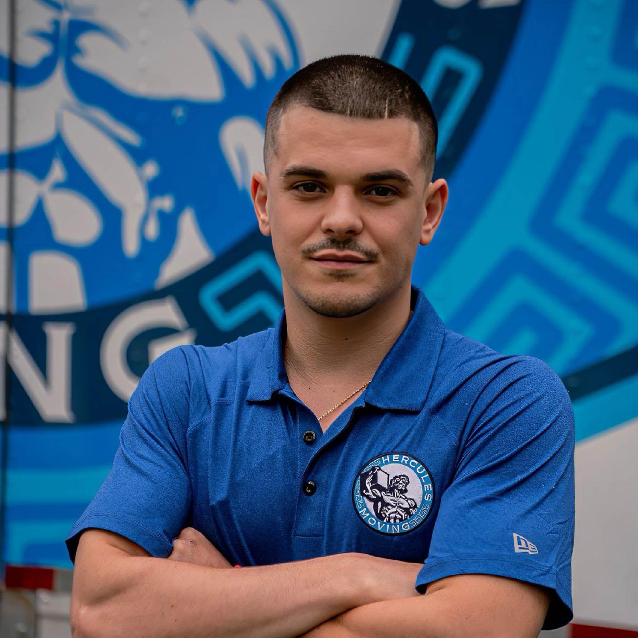
A complete brand identity designed to reflect the strength, reliability, and professionalism behind Hercules Moving. The new system elevated their presence across trucks, apparel, and digital platforms while building stronger recognition throughout their market.
Overview
Hercules Moving came to me with a strong reputation locally but a brand that did not reflect the professionalism, strength, and reliability they delivered every day. Their existing identity lacked consistency across trucks, apparel, and digital platforms, making it harder to stand out in a highly competitive moving market like Chicago.
My goal was to build a brand that felt dependable, recognizable, and scalable. I created a visual identity rooted in strength and clarity, inspired by the mythological symbolism of Hercules while keeping the execution modern and practical for real world applications.
The result was a cohesive brand system designed to perform everywhere, on trucks, uniforms, signage, and digital platforms. Every element was built to increase recognition, build trust, and position Hercules Moving as a premium service provider in their market.
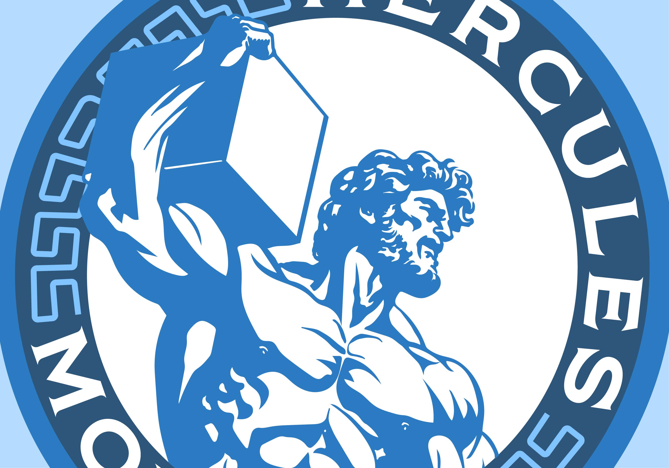
• Developed a bold and recognizable logo system
• Created consistent branding across vehicles, apparel, and marketing
• Designed a scalable identity for long term growth
• Positioned the company as a trusted professional service

Challenge and Results
The primary challenge was transforming a functional business into a memorable brand without losing the authenticity that customers already trusted. Hercules Moving needed an identity that felt strong and professional while still approachable and local.
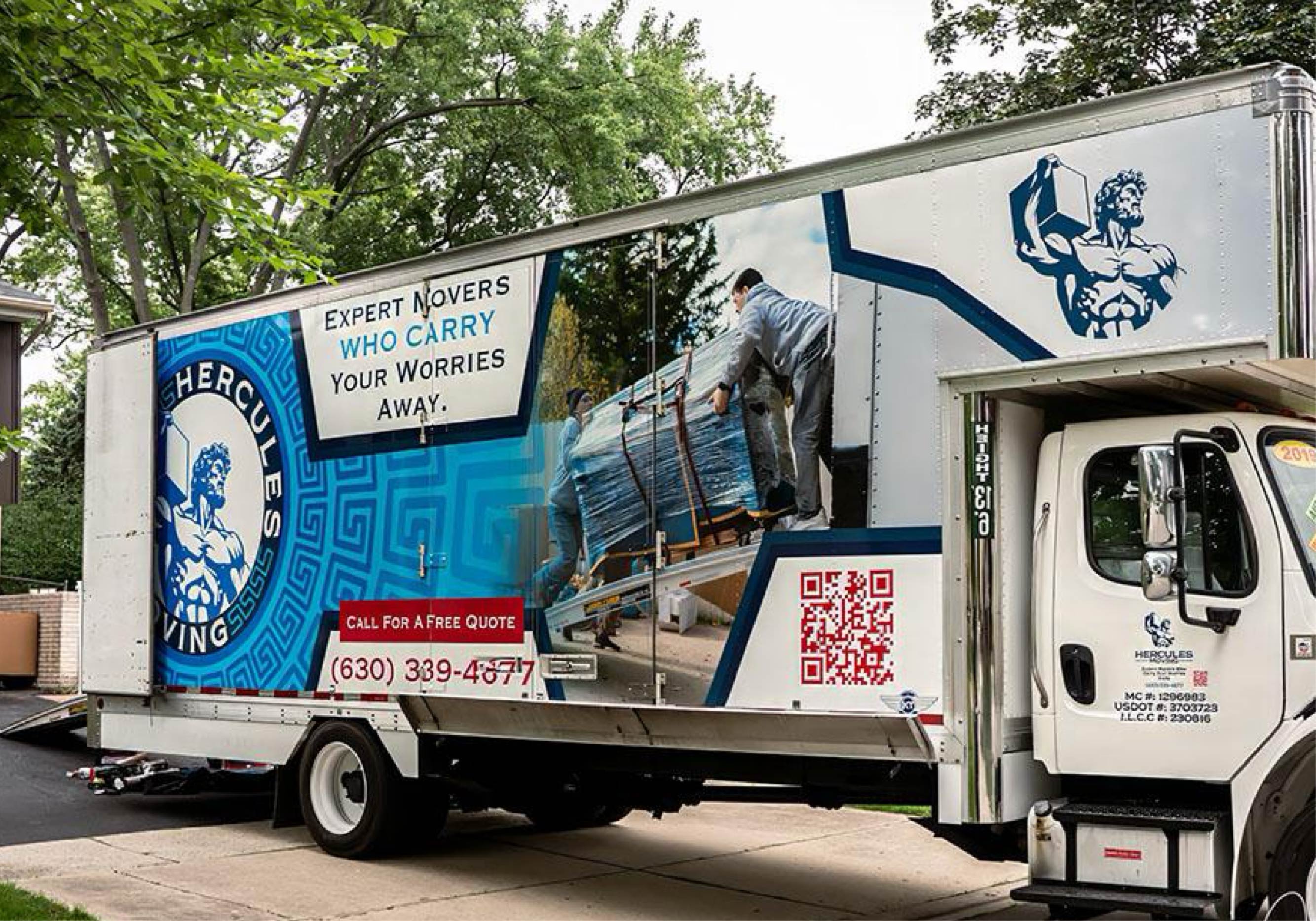
I focused on building a brand that communicated reliability at first glance. The new logo, typography, and color system were designed for maximum visibility and clarity, especially on moving trucks where brand recognition plays a major role in generating new business.
The new identity immediately elevated their presence in the market. Their trucks became moving billboards, their team looked more professional on site, and their brand began to feel established and trustworthy.
• Increased brand visibility across the Chicago area
• Improved professionalism and team presentation
• Created consistency across all customer touchpoints
• Built a foundation for future marketing and growth
The brand now reflects the quality of service Hercules Moving delivers. It gives them the confidence to compete with larger companies while maintaining the personality and reliability that made them successful in the first place.
This project transformed Hercules Moving from a service provider into a recognizable brand.
Michael Mazzocchi
"I can’t recommend Gavin highly enough! Before working with him, I had gone through three different logos, never quite getting the right look and feel for my brand. When he stepped in, he created an incredible logo that finally captured the identity of my company. Since then, he has been my go-to for all my graphic design needs, and he never disappoints.
Most recently, he designed a stunning, one-of-a-kind truck wrap for my moving company. His attention to detail, creativity, and ability to bring my vision to life were outstanding. Unlike many designers who use generic, cookie-cutter templates, he takes the time to craft something unique and tailored to your business. He is extremely versatile in his designs and always open to feedback, ensuring that every project is something truly special.
If you’re looking for a designer who listens, collaborates, and delivers exceptional work, look no further. He’s a true professional and an asset to any business looking to elevate its branding!"